One symbol, used consistently
The VOREXA symbol is fixed. It is never redrawn, recoloured, stretched, simplified or replaced — across the website, token metadata, app, socials and documents.
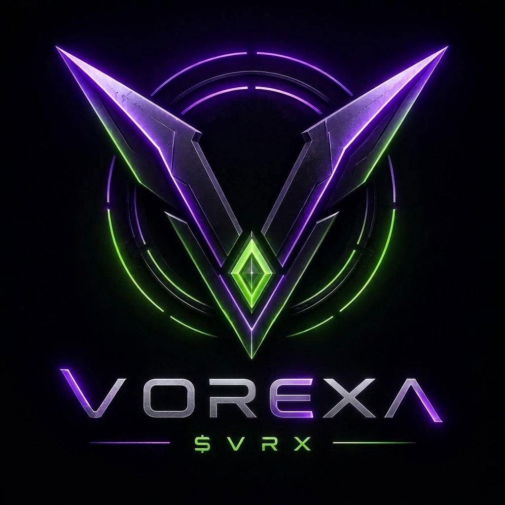
Primary symbol. Minimum clear space equals half the symbol width on every side.
Correct use
- — Always on a dark or black background
- — Scale proportionally, never stretch
- — Pair with the VOREXA wordmark and $VRX sub-mark
Never
- — Recolour, outline or flatten the symbol
- — Add effects, rotate or crop the wings
- — Place on light or busy photographic backgrounds
Colour and typography
Display — Orbitron
VOREXA
Headlines, wordmark, section titles. Wide letter spacing.
Body — Space Grotesk
Interface and long-form text. Technical, readable, neutral — it lets the symbol carry the personality.
X, Telegram and Discord branding
X / Twitter
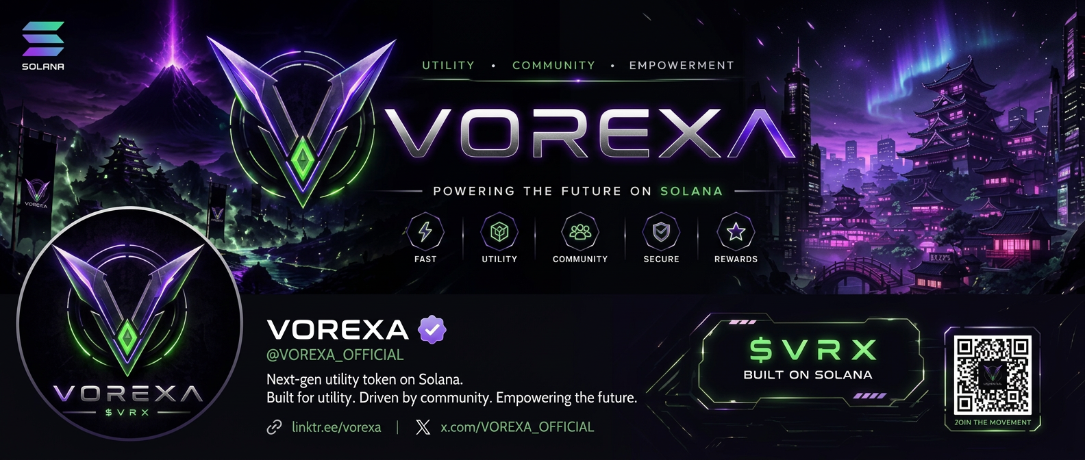
Profile picture: the VOREXA symbol on pure black, centred, no crop into the wings. Header: the full banner lockup. Handle @VOREXA_OFFICIAL. Bio: 'Next-gen utility token on Solana. Built for utility. Driven by community.'
Telegram
Group icon: the symbol only. Group name 'VOREXA | $VRX Official'. Pinned message links website, contract address and transparency page. Admin tags use neon green.
Discord
Server icon: the symbol. Banner: the wide lockup. Role colours follow membership tiers — Initiate violet-dim through Vanguard neon green. Token-gated channels per tier.
Investor & community deck outline
Ten slides, dark background, symbol on every slide footer, one idea per slide.
All brand and presentation materials must avoid profit promises, guaranteed returns or price targets. Communicate utility, transparency and long-term development only.